
Dream big.
Brand bigger.
We build a company's brand from the ground up and look after it as the business grows: strategy, identity and website first, then content, social media, campaigns and the tools the company needs. Photography and software come from the same house. One thread, from the first decision to everyday communication.
01 Build
Company and brand, from the ground up.
Before a logo or a website, we clarify the offer, the audience and the reason to choose the company. Positioning, values and tone of voice come first; name, identity, website and the digital setup follow from them. Depending on what already exists, we build the foundation together or develop an established identity further, with one point of contact from the first decisions to the launch.
01. Strategy
Foundation
Naming logic, brand values, audience, positioning, tone of voice. We articulate what the company stands for before a single visual decision is made.
02. Identity
Visible layer
Logo and wordmark, colour, typography, imagery and layout rules. The formats the business needs now and a consistent basis for what comes later.
03. Touchpoints
In the world
Stationery, website, social channels, signage, print, packaging, digital tooling. The brand expressed where the customer meets it.
04. Guidelines
Carried forward
Practical guidelines and reusable assets, so the team applies the identity consistently and the ongoing work in chapter two has a system to follow.
What a build includes
The scope is agreed around the business. A young company usually needs all of it; an established one picks the parts that are missing.
Foundation
- Positioning, brand values and audience
- Naming and tone of voice
- Logo, wordmark and visual identity
- Brand guidelines and reusable assets
Launch
- Website: concept, design and development, mobile first
- Digital setup: domain, email, Google Business, CRM and accounting links
- Stationery, print and the first touchpoints
- Launch communication and handover to ongoing care
Our own system, as the example
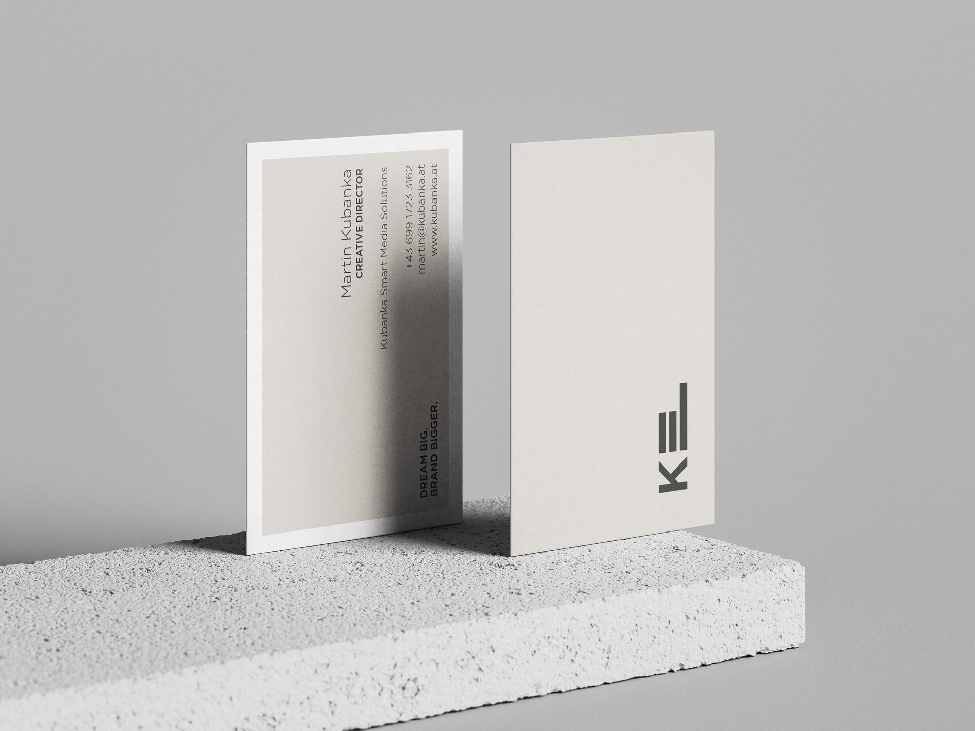
Charcoal and beige anchor Kubanka's identity, cream and paper provide its surfaces, Inter carries every word in three weights. Each client's identity is developed for their positioning, not copied from ours.
 Primary · on charcoalSecondary · on cream
The incubation model
We accompany companies from the first idea through launch and ongoing development. Strategy and design stay connected to the practical work of bringing the business to market, and the same system later guides content, social media and campaigns.
Values are written down first, as the criteria every later decision is measured against: a typeface, a colour, a paper stock, the tone of an enquiry reply. If the promise is personal service, the website and the everyday communication have to keep it.
02 Care
Ongoing care: content, channels, campaigns.
After the launch a brand needs a rhythm. We keep the channels active, plan and run campaigns and read the numbers in plain language. Scope and cadence are agreed around the business, from a monthly content plan to a full communication mandate, always in the identity built in chapter one.
Social media management
Channel strategy, editorial calendar, post design, copy and publishing. Community management and response times are agreed as part of the scope.
Content production
Photography, video and text for the channels the brand actually uses, planned ahead and reviewed against the visual line.
Campaigns, social ads and Google Ads
Every campaign starts with an objective, an audience and an agreed budget. Creative variants, delivery and enquiry quality are reviewed while it runs; paid reach needs media spend.
Search and AI visibility
Technical checks, useful content and consistent company information help people, search engines and AI assistants find and understand the business. Ranking and citation remain their decision.
Newsletter and email
Concept, design and consent-based sending to an opted-in audience. Clear content, useful timing, delivery and responses reviewed.
Analytics, reporting and consulting
Privacy-first measurement that answers real questions: what was seen, what was clicked, what it led to. Reported in plain language, with media and communication advice where a decision needs a second view.
From campaign to customer
From the first creative to the enquiry page, a campaign needs a connected path: objective, audience, message, channels and budget planned before anything goes live; social ads, creative variants and rollout across the agreed channels; a relevant landing page, a clear call to action and an agreed handover for follow-up.
We review enquiry quality as well as clicks. The diagram shows the intended journey, not a guaranteed conversion; sales depend on the offer and the conversation that follows.
03 Produce
Photography and video, on the brand's line.
Images and film carry the identity into daily use. We produce in house: brand and product photography, event coverage from a product presentation to a race weekend, portraits, image films and short clips cut for each channel. One consistent look across every picture.

Events and motorsport
Race weekends, launches, trade shows and company events, covered as reportage.

Product presentations
Roadshows, showrooms and product days, from the arrival shot to the last detail.

Brand and product photography
Studio and on location. Details, portraits and the pictures a website and a campaign are built on.
Video and short-form
Image films, event recaps and clips for social, cut and framed for each channel.
04 Software
When the brand needs a tool, we build it.
Brand building increasingly ends in software: a booking flow, an internal dashboard, a product configurator, an automated workflow. We design and develop lean digital solutions that carry the brand system into the product itself, same typography, same tone, same thread.
01
Custom web applications
Tools built around how the company actually works: booking and enquiry flows, configurators, client portals, internal dashboards. Lean, fast and branded down to the last form field.
02
Automation and integrations
Connecting the systems a company already uses, CRM, accounting, email, scheduling, so repetitive work runs by itself and the team can focus on the product.
03
Digital products
From prototype to launch: scoping, architecture, development and maintenance of small digital products that extend the brand, with the same care as every printed touchpoint.
05 Approach
How we work.
We clarify the offer, the audience and the competitive context before recommending a direction, and we work closely with founders and their teams: direct communication, short decision paths and transparency at every phase. Positioning, tone of voice and visual identity give the company a consistent basis for decisions as its needs change.
01
Concept before design
No logo before the positioning, no website before the content. The thinking comes first, and it is written down, so every later decision has something to be measured against.
02
Remote by structure
The agency is built to operate fully remote: location-independent, lean and cost-efficient. No offices for the sake of appearances; resources flow into the work. Distance is no obstacle to proximity in a project.
03
Professional restraint
We agree what can be shown and keep the presentation proportionate to the work. A clear explanation of our role matters more than a long list of client names.
The thread
A red thread runs through the entire system.
Every decision, from the typography of a footer to the paper stock of a business card, runs along the same thread. Consistency is not a constraint; it is the device that lets a brand accumulate meaning over time. The longer the thread, the more recognisable the brand becomes.
Media network
Sociaty, where it fits.
Kubanka also operates Sociaty, a media network spanning Sociaty, Fembase and MemeCulture. Where audience and format fit, a placement can complement a client's communication plan. Availability and scope are agreed separately.
Starting a company, rethinking an existing identity or looking for ongoing support? Tell us where you are today. We will work out the next steps, from strategy and design to the website and the communication that follows.
Start a Conversation